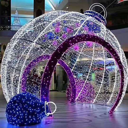
Many buyers share the same concern when discussing colorful festive lighting: Will colorful lights make the project look messy or low-end once installed?
The truth is, the issue is rarely the lights themselves. In commercial projects, the real difference lies in the lighting coordination strategy.
Used correctly, colorful lights can attract attention, guide foot traffic and enhance seasonal appeal. Used without a clear logic, they can easily dilute the overall quality of a space.
Based on our experience working with shopping malls, commercial streets and large retail developments, here are several practical principles that consistently deliver clean, premium-looking results.
1. Limit the Number of Colors
No matter how large the project is, the primary color palette should
generally be limited to two or three colors.
For example:
• Red + warm white
• Gold + warm white
• Blue + cool white
These combinations remain visually clean and easy to read from a
distance. As the number of colors increases, visual noise increases as
well — which is one of the most common reasons festive lighting
appears cluttered or unrefined.
2. Clearly Define Main Lighting vs. Accent Lighting
In commercial environments, colorful lights work best as accent
elements rather than the main atmospheric source.
They are particularly effective for:
• Outlines and contours
• Decorative highlights
• Guiding visual focus and movement
The main ambient atmosphere is better delivered by warm white or a
single, consistent color temperature. Once this hierarchy is established,
depth and a sense of quality naturally follow.

3. Maintain Consistent Color Temperature and Brightness
Mixing different color temperatures or uneven brightness levels within
the same visual field is one of the fastest ways to make a project look
inexpensive.
In professional commercial projects, lighting effects are usually
planned in advance to ensure:
• Unified color temperature
• Balanced brightness levels
• Consistent visual rhythm across the space
This consistency is essential for maintaining a polished and intentional
appearance.

4. Let Colorful Lights Serve the Space — Not Compete With It
Colorful lighting should enhance the architecture and commercial
function of a space, not overpower it.Best practice applications include:
• Using colorful lights to highlight entrances, windows and trees
• Emphasizing building structures and façades
• Keeping large public walkways and open areas visually restrained
A more controlled approach often results in lighting schemes that are
not only more visually appealing, but also more effective from a
commercial perspective.
Clear Design Beats Maximum Color
Across many completed projects, the most successful festive lighting
schemes are rarely the ones with the most colors.
Instead, they are defined by clarity, rhythm and thoughtful visual pacing.
If you are currently planning colorful festive lighting for a shopping
mall, commercial street or retail project, feel free to share your
application scenario with us. A well-considered lighting plan can make
all the difference.


